Improving live event discovery
A calendar experience that helped learners find the sessions most relevant to them.

Product Design
UX Design
Gamification
Overview
From a confusing schedule to a clear experience that drives attendance and retention.
Platzi is built on community and consistency. Every week it publishes live and on-demand content, including mentoring sessions, open talks, and course launches, as well as Platzi LIVE every Thursday from 3 to 5 PM (CST). With ≈150 events each month, the public schedule was a critical part of the journey: helping people discover content, return week after week, and turn curiosity into learning.
Problem
The schedule created critical friction. Users could not tell what was on the calendar, what was live versus recorded, what was worth watching, where to join, or when it started. This increased bounce rate and caused people to miss relevant events. The product had been designed for a smaller use case, but the calendar had scaled with more formats, volume, and simultaneous events while its legacy UI and visual hierarchy had not kept pace.
Research
To make sure the redesign solved the real problem, not just the visual one, I focused research on why people struggled to understand the schedule and what they needed to make a decision:
Feedback and behavioral-signal review
Quick entries and exits suggested shallow scanning, alongside clicks that did not convert to event views and repeat visits to the schedule without completing an action.
Content and system-complexity analysis
The calendar handled a high monthly event volume, with a significant recurring share (≈35% at the same weekly time). It also covered multiple event types, including live sessions, releases, 24/7 recordings, and Zoom events, across different access levels: annual subscription, Master, and special events.
Quick guerrilla comprehension tests
Task prompts included: "find the next Platzi LIVE," "find something to watch today," and "tell whether this is live or recorded." Recurring findings included missing status cues, unclear CTAs, and little support for filtering without getting lost.
Design Decisions (what I did differently)
Based on the findings, I made product and design decisions to reduce cognitive load and strengthen intent:
- Mobile-first by design: A large share of users connect from mobile, so the experience had to work on small screens first.
- Clearly separate exploration from decision-making: These are two distinct moments in the user journey.
- Clear states: Live / Upcoming / Recorded / Recurring / Special.
- Reduce noise with filters and grouping: Filter by type and relevance, then group related events.
- Define metrics through design: Every decision tracks comprehension, engagement, conversion, and return visits.
Solution
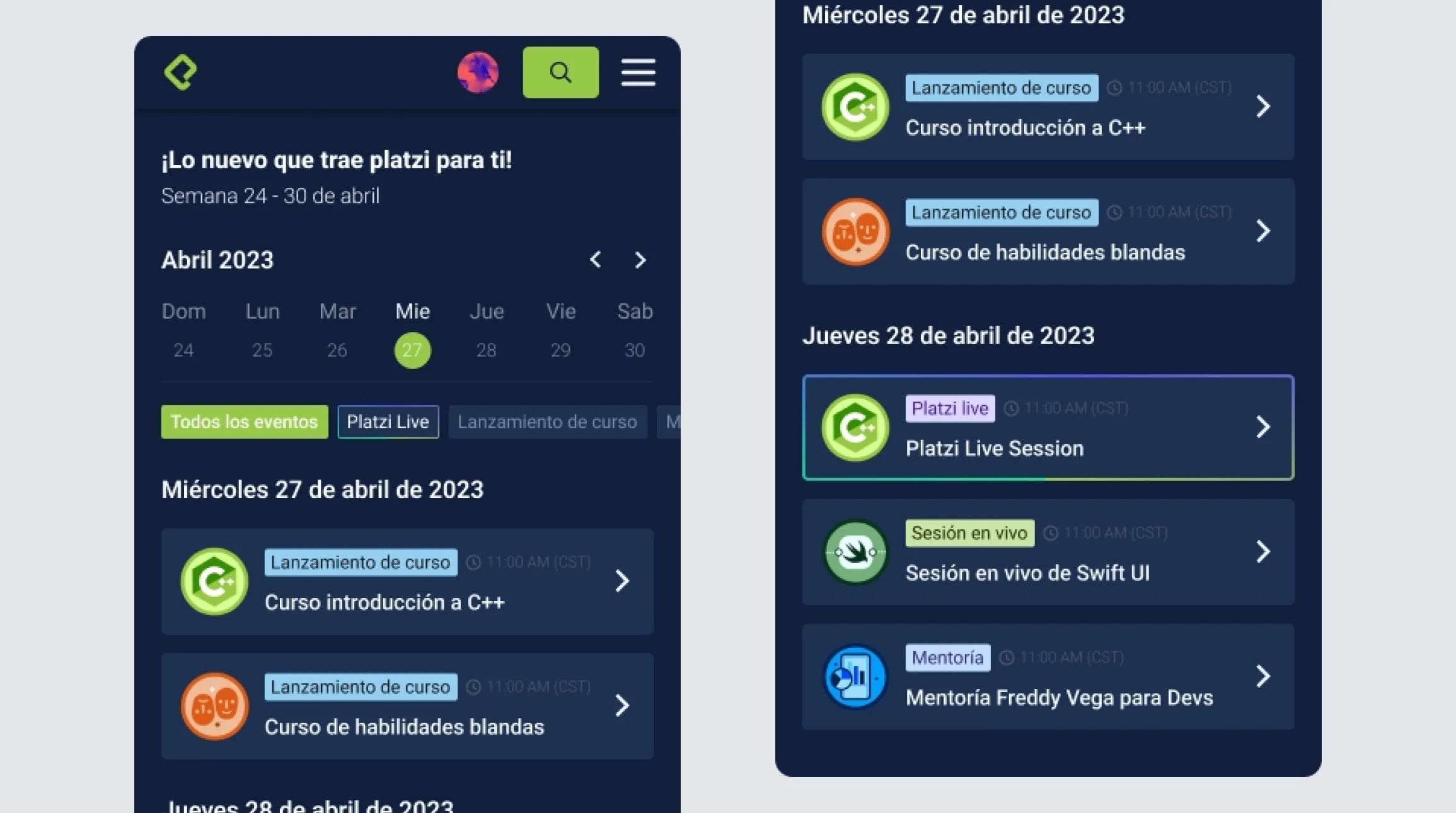
I redesigned the schedule as an experience built for clarity and action, not simply an event list:
Schedule view with strong hierarchy
Prioritized the featured event, such as Platzi LIVE when relevant, with dedicated Today and This Week modules.
Support for recurring events
A more compact, predictable presentation for weekly patterns.
Quick filters and lightweight search
Made it easier to navigate 150+ events/month without losing context.
States and microcopy designed for understanding
Simple language, such as "Live," "Recorded," and "Starts in X," reduces interpretation.
Event cards with only the information users need
Event type (badge), a clear time, viewing location (Platzi / Zoom), and a direct CTA: "Watch live," "Watch recording," or "Remind me."
Impact
Lower bounce rate
Bounce rate on the schedule page fell from 25% to 18% versus the previous baseline.
Higher event-detail click-through
+30% to +45% more clicks to event details or the primary action ("watch / join").