Simplifying credit decisions
A clearer product experience for understanding and acting on credit information.
Product Design
UX Design
Design System
Overview
Radical clarity that turns friction into action
Círculo de Crédito is one of Mexico's leading providers of financial insights, including credit profiles, monitoring, and security tools. Despite its market position, its digital ecosystem (web + app) did not reflect that leadership. The experience lagged behind modern fintech standards, with lengthy flows, unclear interfaces, and fragmented architecture.
Problem
The experience made people think too hard. Which product should they choose? What did each option mean? What happened next? Instead of guiding them, the product created doubt. In financial products, every doubt becomes friction, and every friction point leads to abandonment.
Research
Rather than starting with methods, I began with a simple question: exactly where were we losing users, and why?
Understanding real behavior
Funnel analysis revealed a clear pattern: sharp drop-offs immediately after users viewed products, abandonment in the first third of onboarding, and users returning several times without purchasing. The issue was not intent. It was clarity.
What we saw in live sessions
Session reviews and quick unmoderated tests surfaced specific friction points: users compared products without understanding the differences, hesitated before clicking "Continue" (with consistent micro-pauses), and struggled with financial terminology and unclear naming.
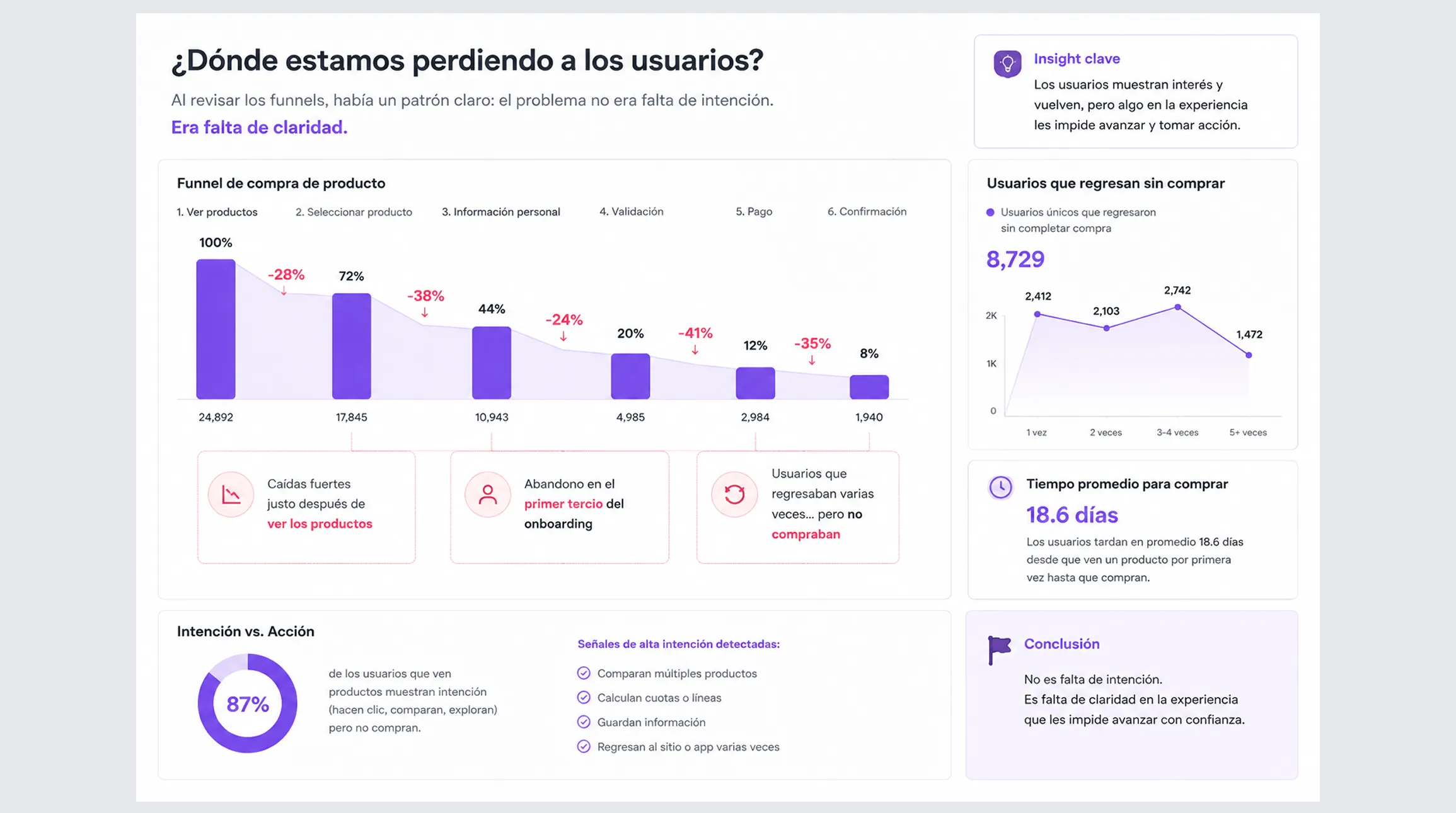
The biggest problem was not that users could not complete the flow. It was that they did not feel confident enough to do it.
Internal audit
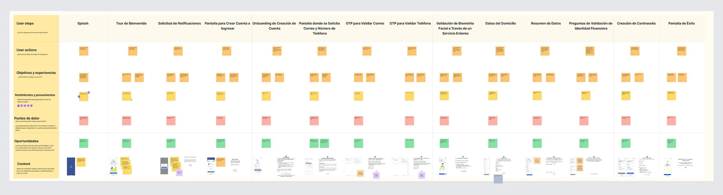
Mapping the end-to-end experience across web and app made it clear that the product had evolved unevenly. Its flows did not follow a clear structure; they were the accumulated result of multiple iterations over time, with patch upon patch eroding overall coherence. This showed up as cross-platform inconsistencies, where the same action could feel different depending on the device.
Design Decisions (what I did differently)
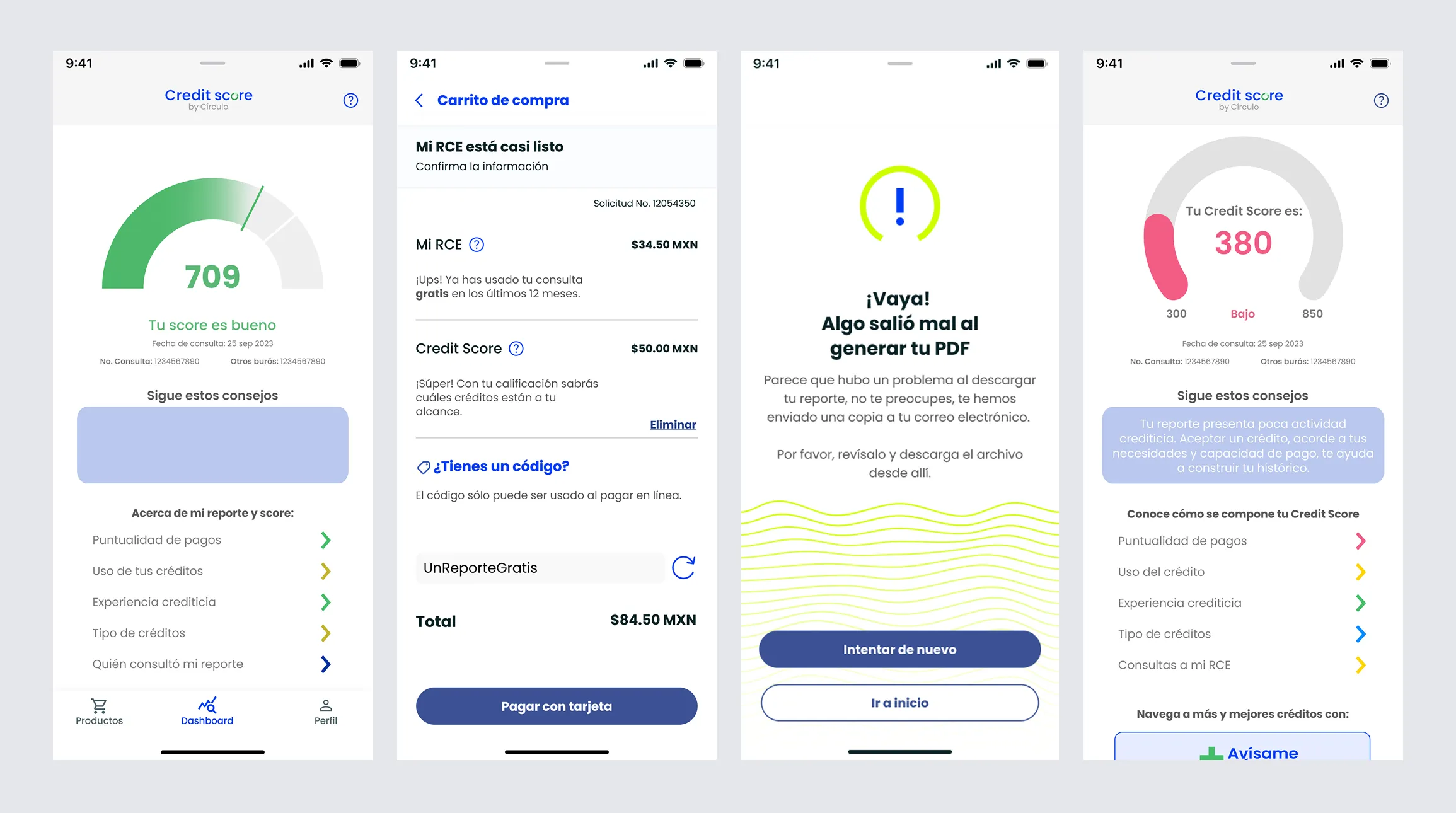
I separated exploration from decision-making so users would not have to understand the product while already purchasing it. Each screen prioritized clarity by reducing choices and focusing attention on one action at a time. A mobile-first approach simplified flows and removed unnecessary friction. Everything was then structured within a design system to ensure consistency and scalability across web and app.
Solution
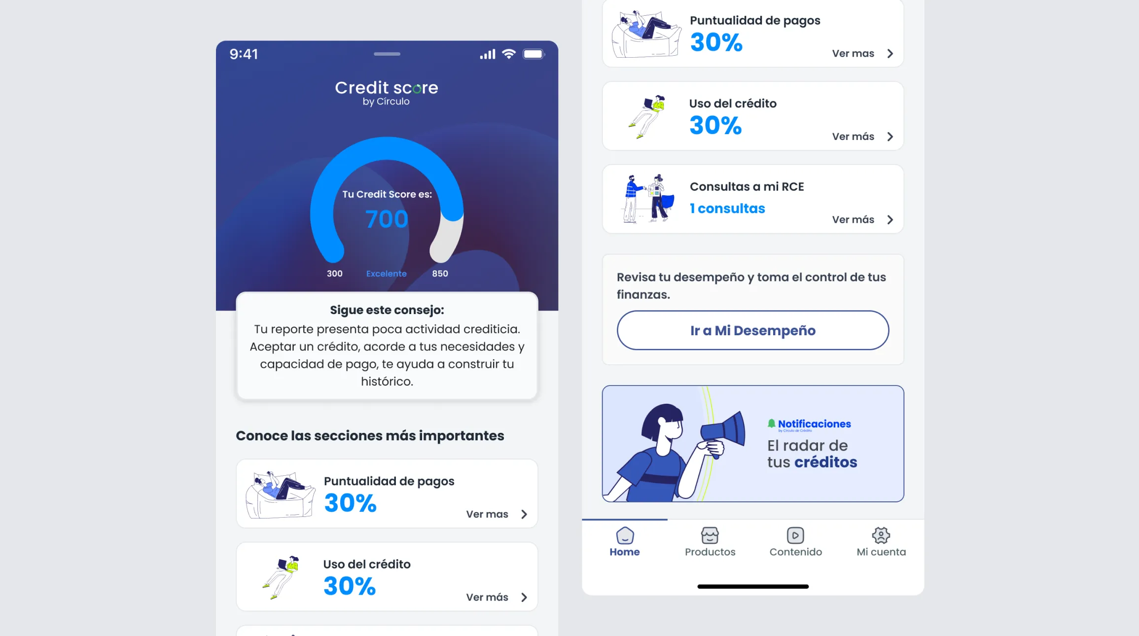
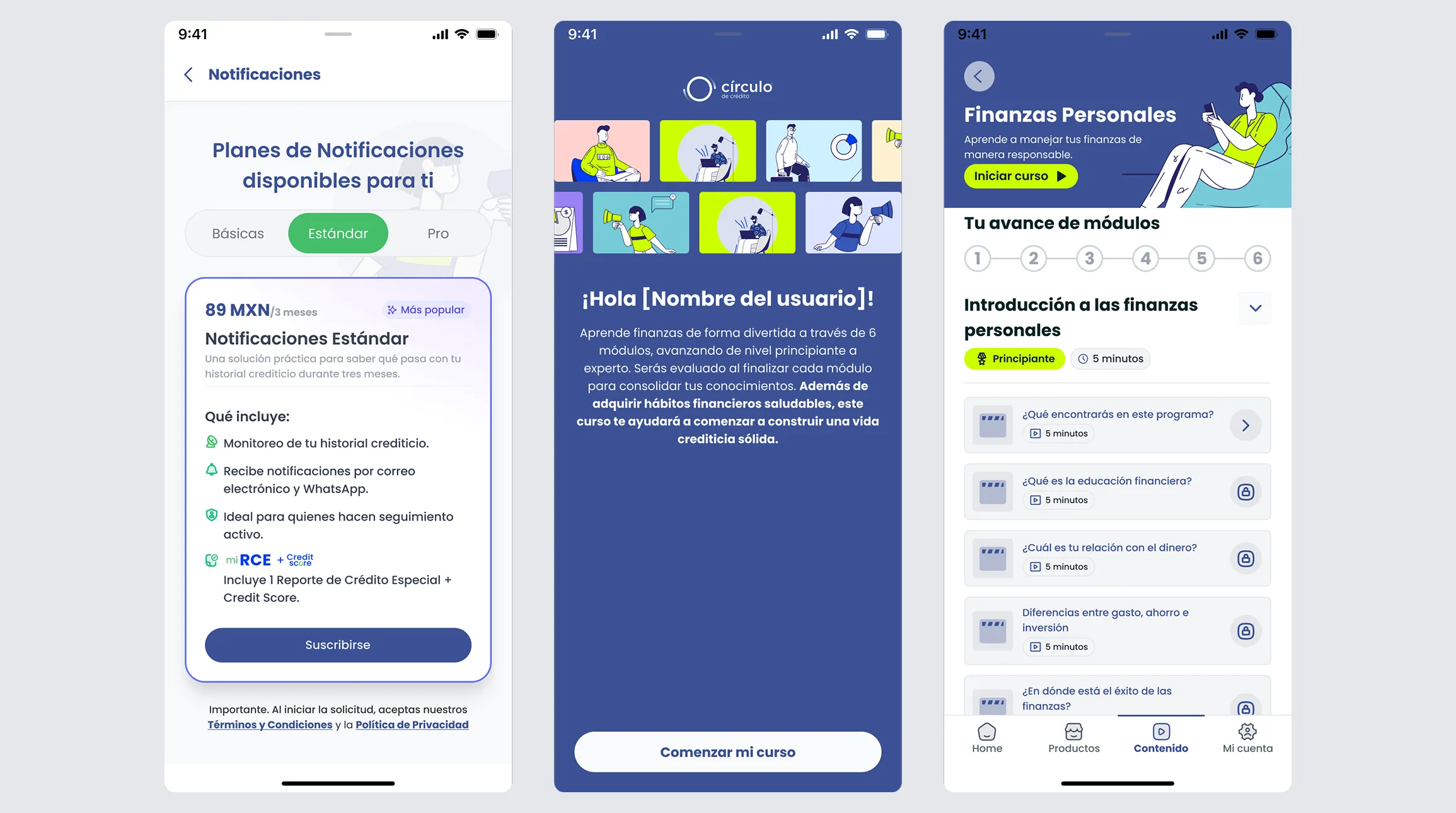
The redesign removed uncertainty and turned exploration into decision-making:
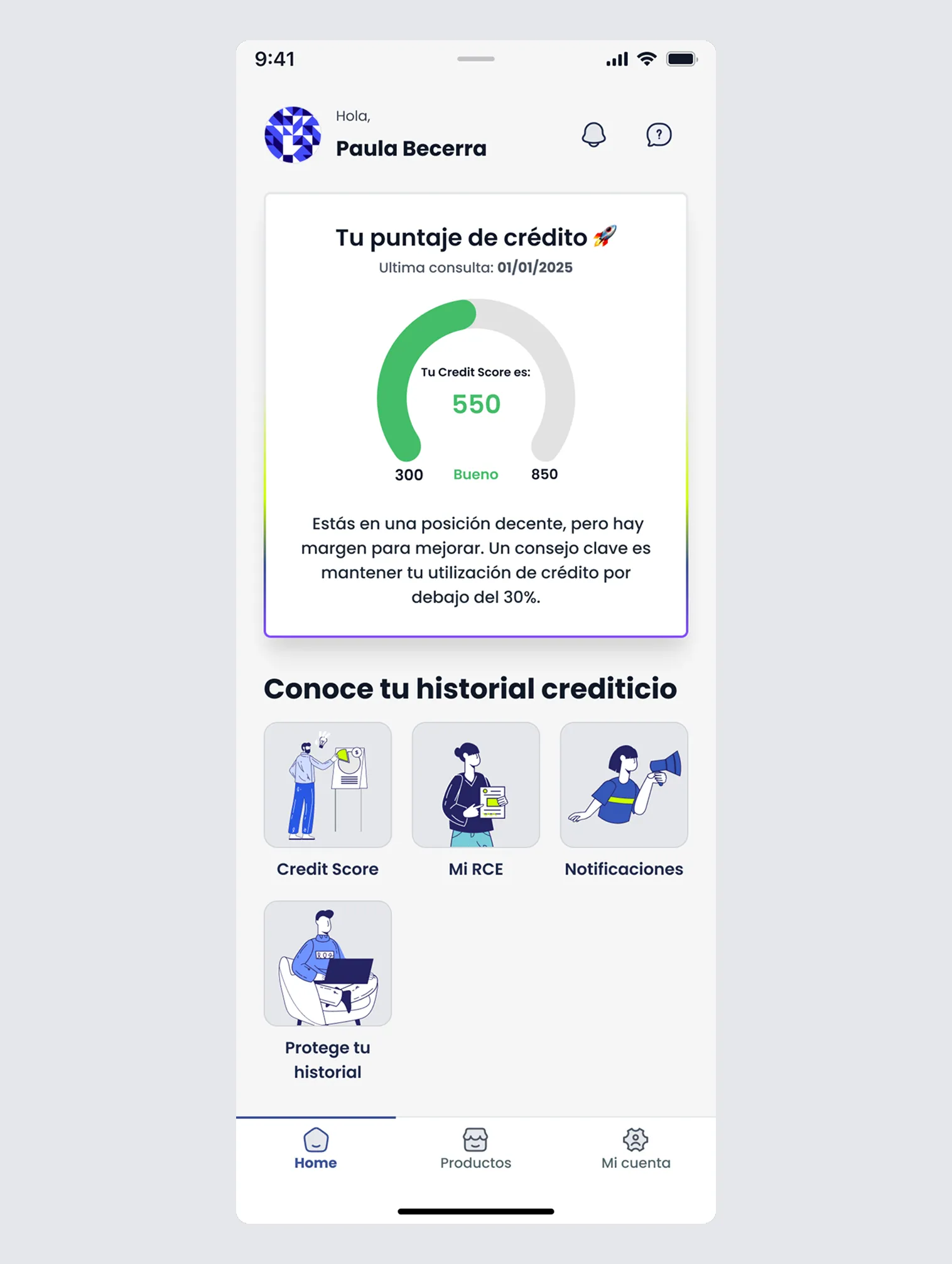
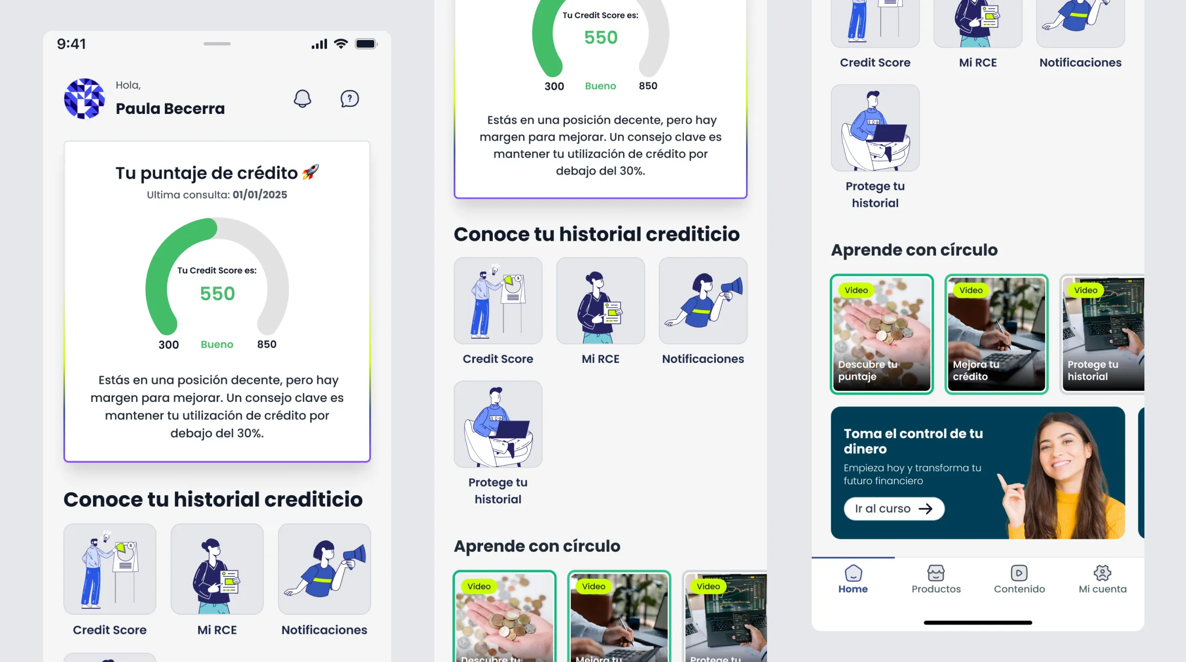
New information architecture
Clear product grouping and a hierarchy based on intent (explore vs. buy).
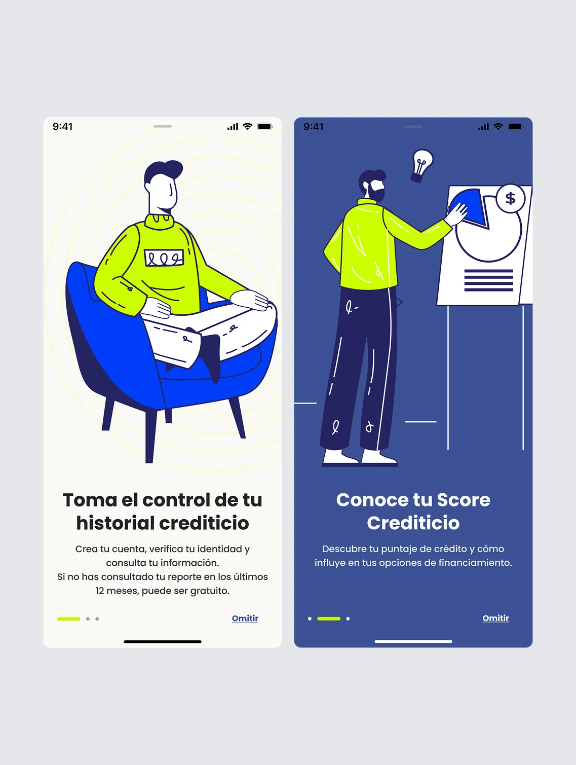
Simplified onboarding
Fewer steps, progressive inputs, and real-time feedback.
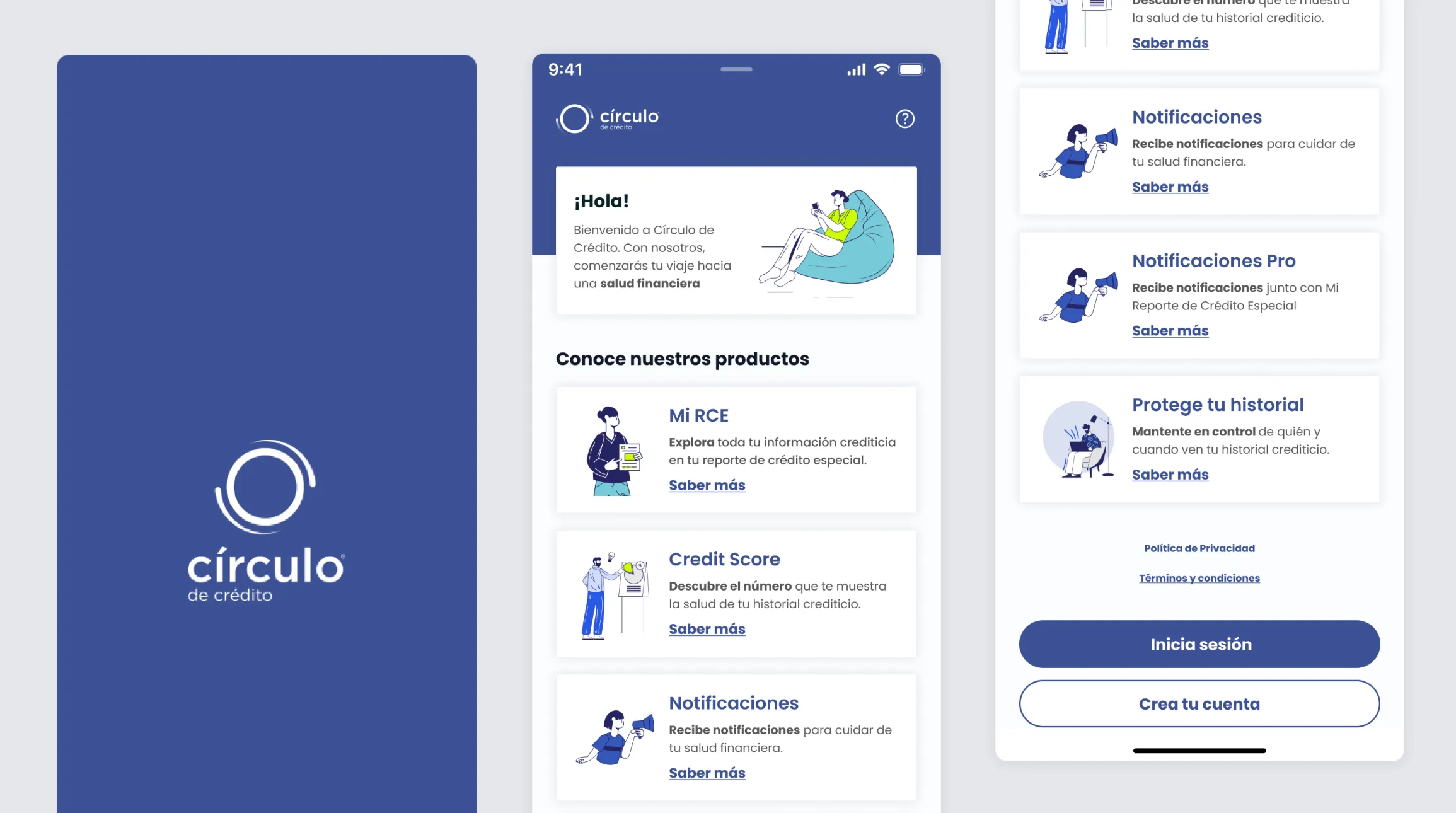
Redesigned product pages
A clear value proposition, plan comparisons, and visible, actionable CTAs.
Impact
+28% purchase conversion
More users completed purchases for core products thanks to a clearer, decision-focused experience.
-35% onboarding abandonment
Early-flow drop-off fell significantly by removing friction and simplifying inputs.
+18% retention (30 days)
Repeat usage improved through a more understandable and trustworthy experience.
+25% engagement with secondary products
Cross-sell increased through clearer product organization and positioning.
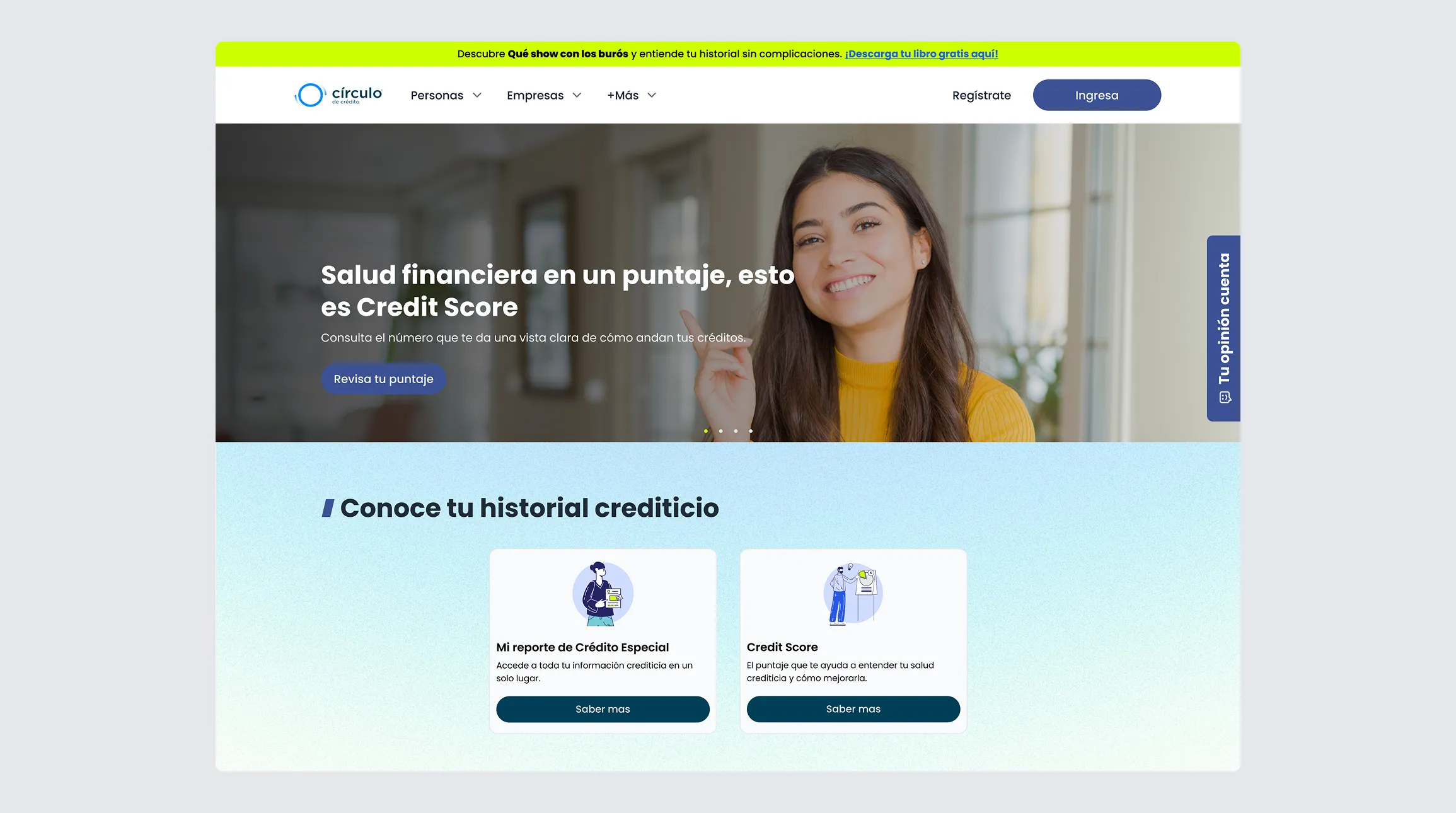
I simplified access to financial information in a space that had long been confusing.