Designing a startup accelerator
A digital experience that made innovation programs easier to discover and join.

Role:Product Designer
Timeline2020
Skills
Design System
Product Design
Prototyping
Overview
Building the Foundations
AB-InBev launched 100+ Accelerator, an initiative that attracts and accelerates startups with high-impact solutions. The challenge was to turn a complex program (applications, selection, cohorts, partners, FAQs, and news) into a clear, reliable experience across web and app.
The Challenge
The program served multiple audiences (startups, partners, and the internal team) across many sections, creating three common risks:
- Information overload: too many pages and content that was difficult to scan.
- Unclear journey: startups lacked a clear path to understand "what it is" and "what to do next."
- Web/app inconsistency: disconnected experiences that undermined trust and adoption.
Design Goal
Create an experience that:
- Explains the program in seconds (what it is, who it's for, and its benefits).
- Guides startups through a clear flow from discovery → evaluation → participation.
- Establishes a reusable UI foundation (components) that scales across content (cohorts, news, partners, FAQs).
- Maintains a corporate yet innovative tone aligned with AB-InBev.
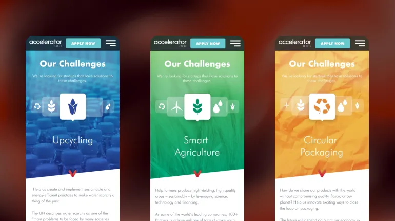
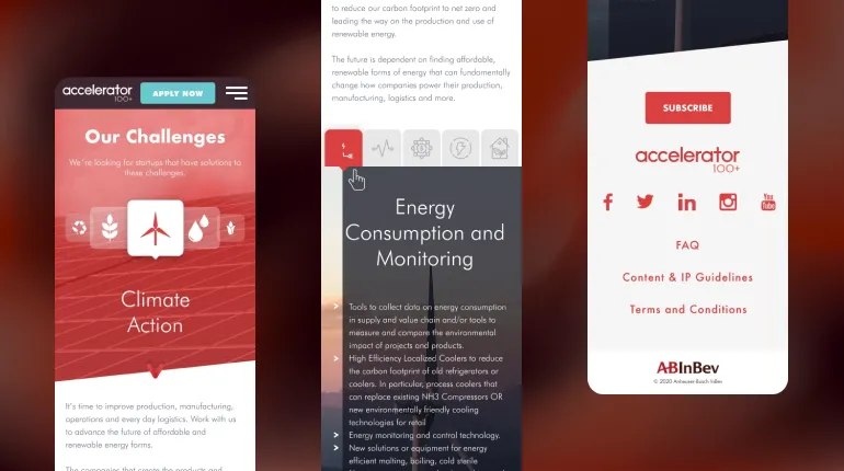
Design Decisions (what I did differently)
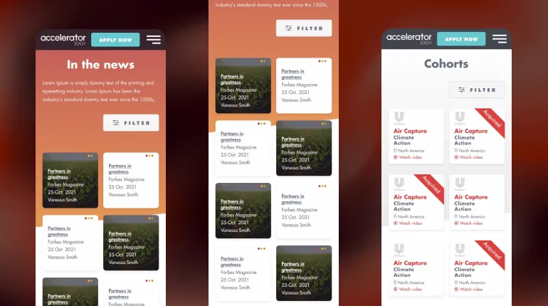
Clear content hierarchy: each section answers a question ("what is it?", "how does it work?", "who's behind it?").
- Card-based content for cohorts and news: reduces friction and supports exploration.
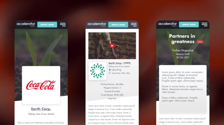
- Consistent web/app navigation and layout patterns: build familiarity and trust.
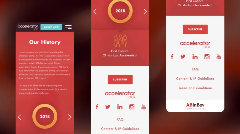
- Credibility-led design: make partners, team, and history visible to reduce uncertainty (key for startups evaluating programs).